When a local cannabis supply company reached out with the need to rebrand their brick & mortar and online presence, we were immediately intrigued. But then, when we recognized their passion and belief in their products’ abilities to support the emotional well being of their customers, we were truly on high alert.
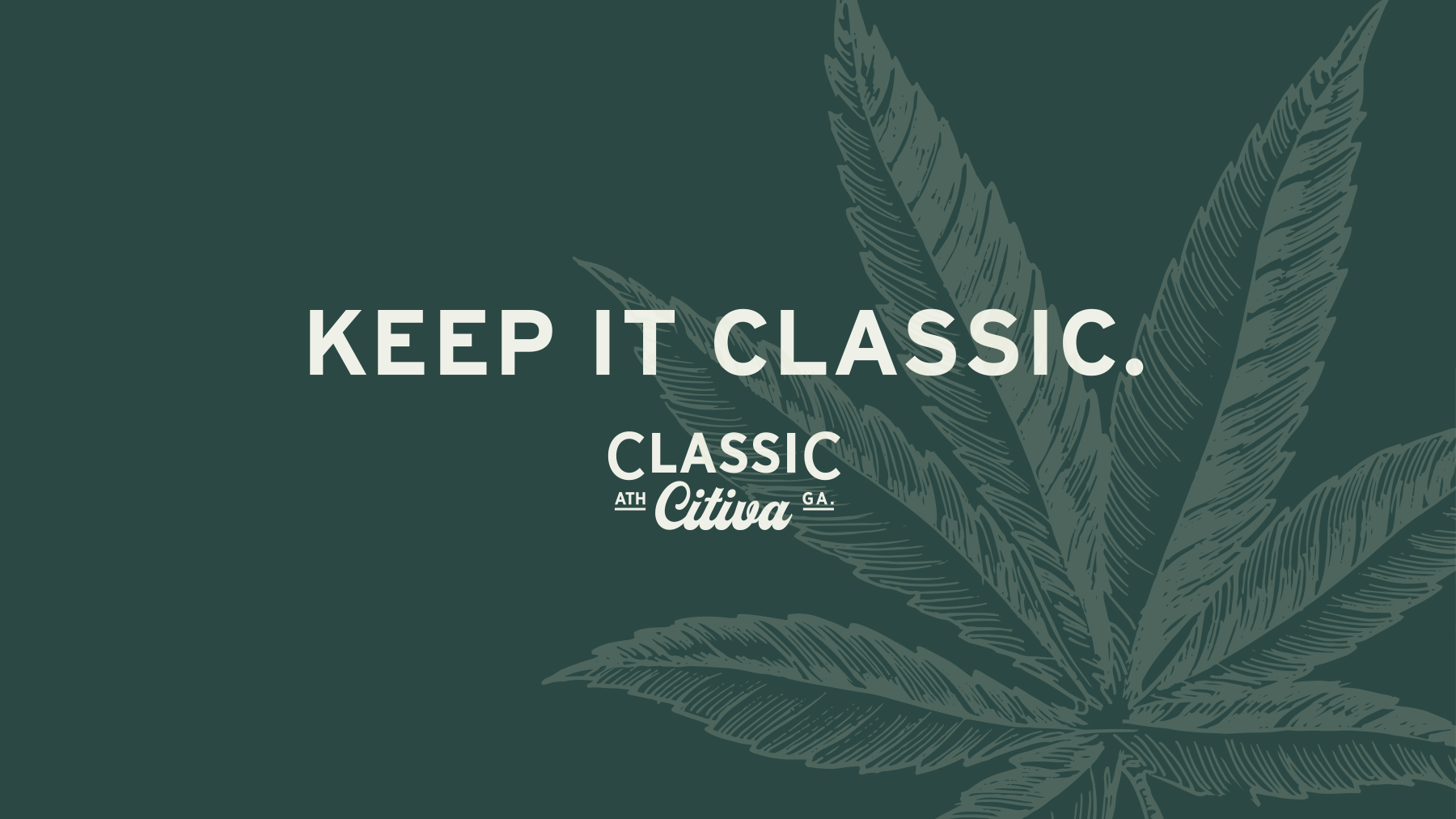
Classic Citiva: A Higher Calling
Read More

Read More
We began with a new name. What would connect locally, clearly speak of the offerings, AND look great on a cap? ‘Classic Citiva’ was our creative take on combining Athens’ nickname, ‘The Classic City’ with ‘Sativa’, a recognizable strain of cannabis.
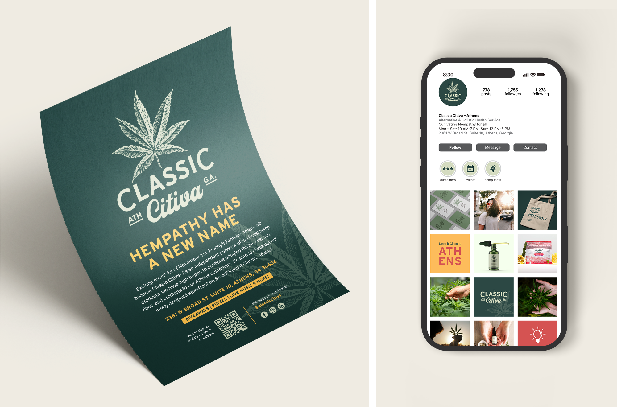
With a solid name in place, we went to work to build the brand. A tagline, ‘Cultivating Hempathy’ was established, and we developed a story around it that speaks to the high level of care and support that Classic Citiva offers to their customers.
The messaging was then further expanded to include several core messages to communicate the varying aspects of the brand.
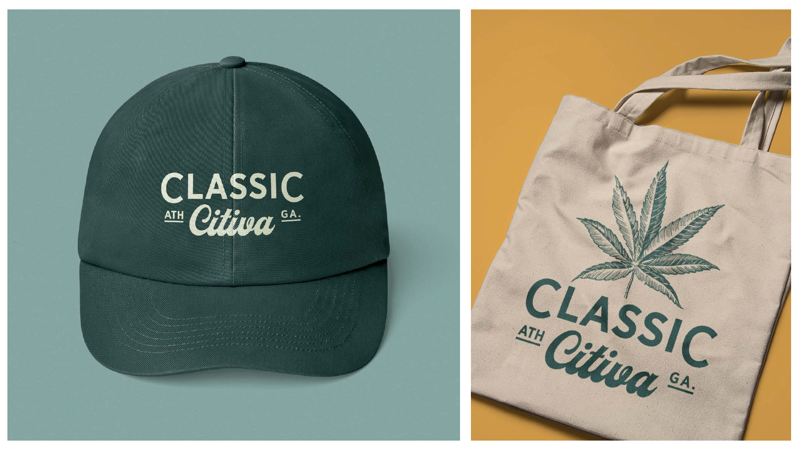
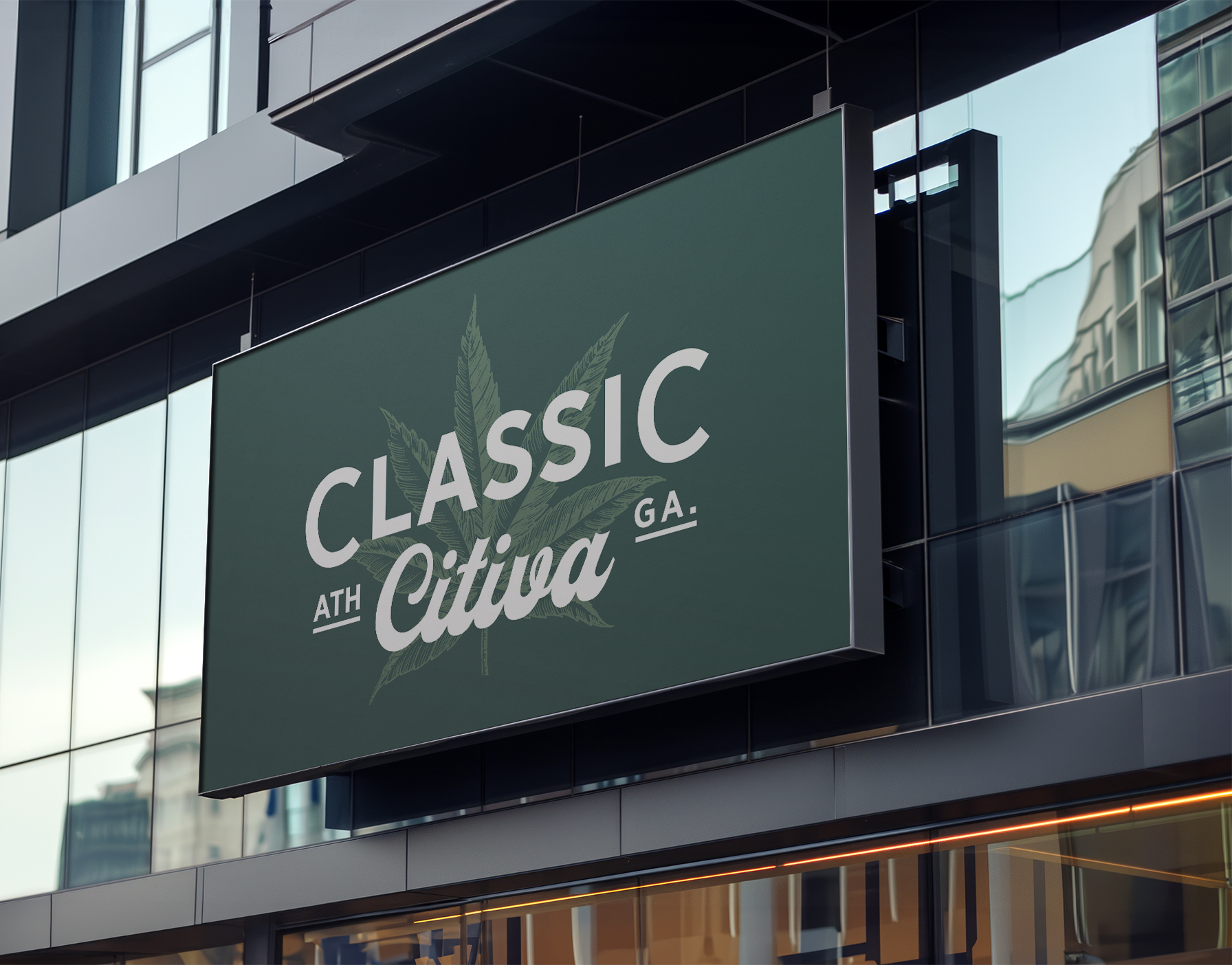
Next came logo design. We knew what they didn’t want: Nothing silly or juvenile, no neon green, nothing expected. We opted for a woodcut sativa leaf illustration, paired with a retro font type, to convey an evolved, confident and established brand.
What followed was a full identity system, store signage, print collateral, and a social media strategy to help elevate the brand.
What We Delivered: