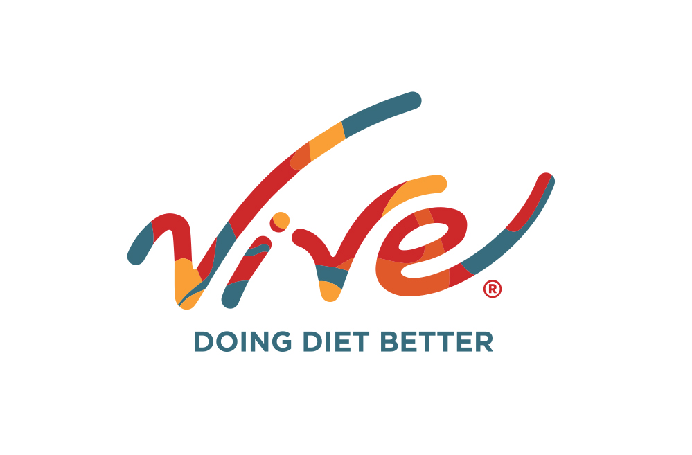
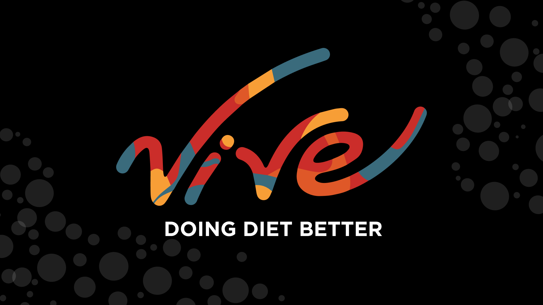
When we first met Clayton from Vive Soda, he already had a vision in his head for what the brand identity and packaging for his all natural diet soda would look and feel like. He just needed some help to bring it to life. We began by adapting his logo sketch into a fleshed out and lasting word mark.
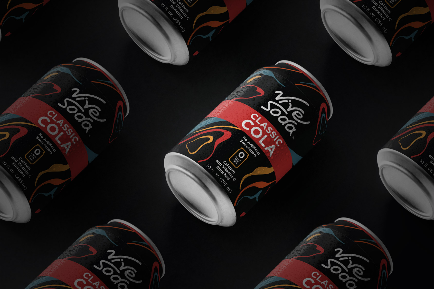
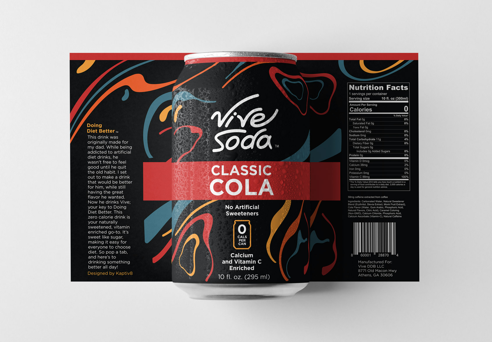
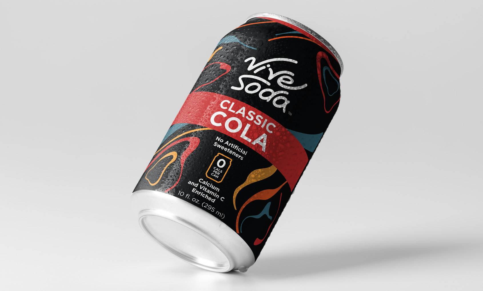
Then came the really fun part! We were able to adapt the identity for Vive’s can labels. By working through a few different iterations – not to mention container types – we found the winning solution. The final label wrapped the can type perfectly.
